Page 1 of 2
Please comment my poster!
Posted: Thu May 17, 2012 9:52 pm
by GrodanBoll
I just designed a poster for my kiteschool. Will print it in A4 format and put on a wall in the gym where I train. Please let me know what you think. Something I can do better? =)
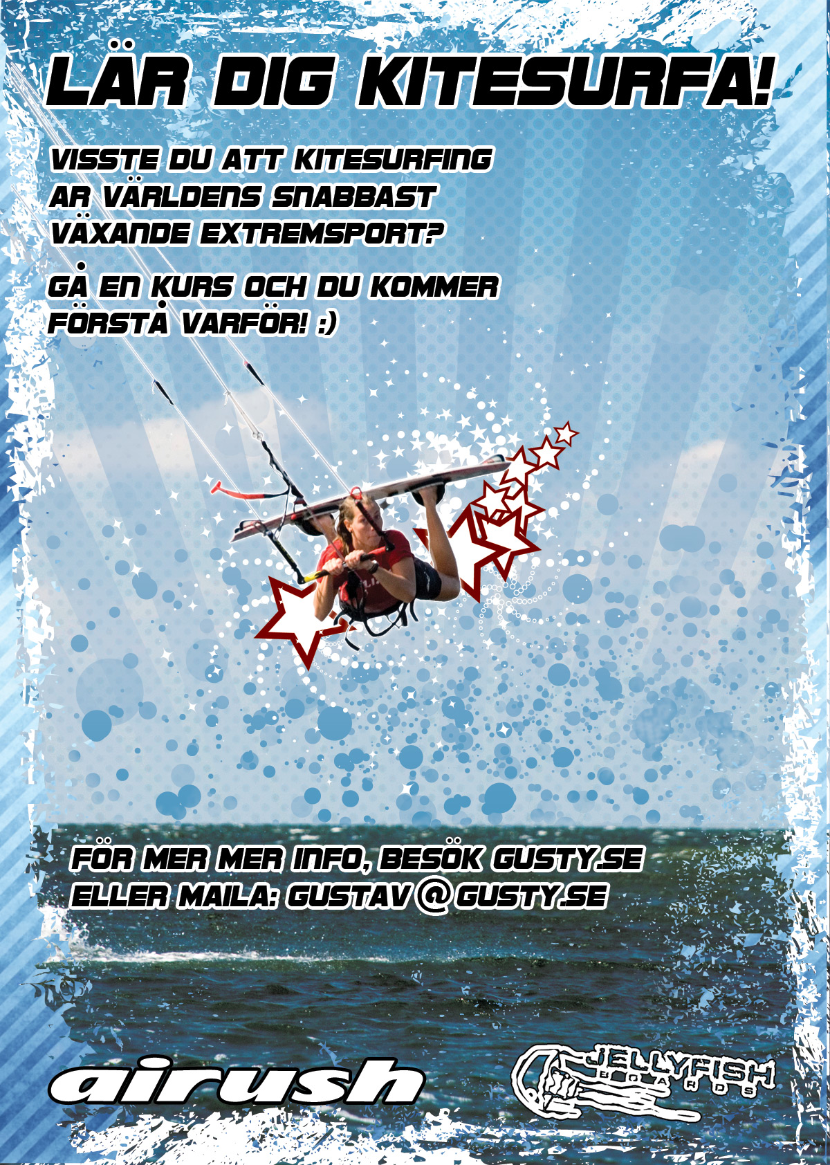
PS. This image is scaled down. The original is of course a high resolution 300 dpi file.
Re: Please comment my poster!
Posted: Thu May 17, 2012 10:05 pm
by tautologies
Nice. Good effort getting feedback. I think you could make your message a little clearer. There is a lot of noise on the poster, which takes away from the message.
First eye catch: Good image.
Next contact you. That part I think has to be clearer and easier for people to get. There is no direct link between the header and you.
I would have the headline Laer dig (at) kitesurfa med then your email.
I would also probably tone down the noise a little.
Re: Please comment my poster!
Posted: Thu May 17, 2012 10:39 pm
by rodeoclown
more cow bell
Re: Please comment my poster!
Posted: Thu May 17, 2012 11:11 pm
by GrodanBoll
tautologies wrote:Nice. Good effort getting feedback. I think you could make your message a little clearer. There is a lot of noise on the poster, which takes away from the message.
First eye catch: Good image.
Next contact you. That part I think has to be clearer and easier for people to get. There is no direct link between the header and you.
I would have the headline Laer dig (at) kitesurfa med then your email.
I would also probably tone down the noise a little.
Thanks, for the feedback! I´ve also been thinking of removing some of the "noise".
Re: Please comment my poster!
Posted: Thu May 17, 2012 11:36 pm
by DrLightWind
Excellent and coherent creation

The girl with the board could 20% larger to enhance,
with the white spirals extending to edge of the water

DrLW
Re: Please comment my poster!
Posted: Thu May 17, 2012 11:47 pm
by Laughingman
DrLightWind wrote:Excellent and coherent creation
The girl with the board could 20% larger to enhance,
with the white spirals extending to edge of the water
DrLW
I agree with 20% larger but the spirals and the stars are too much for me. Also, maybe choose a shot when she is smiling if you have one. Nice to see a young woman ripping it. Catches the eye! Use it!
Re: Please comment my poster!
Posted: Thu May 17, 2012 11:59 pm
by Pietro_2003
Hi,
A few things come to mind.
1. As mentioned before I too would focus more on your 'brand', your name or gusty.se and have it more dominant closer to the headline or part of it - 'Learn to kitesurf with Gusty.se' or something. If someone passes the poster and is not be that interested in kitesurfing might remember enough of the poster (a few words) to remember 'gusty.se' and mention it to a friend. That's not going to happen with it in the body copy at the bottom of the page. Think of how recognizable and memorable kite.se is. By making it into a logo (or dominant i a headline) it makes it easier for people to remember.
2. If you can think away the background pattern for a moment, I'd be looking at making the relationship between the items more dynamic (more contrast in sizes). The kiter can be much bigger. It's a great shot and I'd be at least doubling her in size, have her jump out from the page. I don't mind the 'noise' in the background. Sure, by convention the text might be more difficult to read, but anyone who is grabbed by the word 'Kitesurf' and the babe kiting then they are going to read it anyway.
3. Headline. (think about point 1 again) I'd find a way to pump up the size of kitesurf, that's one of the things that will grab peoples attention just because it is a cool new sport, make it bigger. Having the existing headline on one line feels nice and balanced but being on one line tends to force the headline to be a bit small. Maybe have 'Learn to' on one line and the 'Kitesurf' much bigger on the next line.
My 2 cents worth.
Edit: you're giving more airtime to your sponsors then you are yourself

Re: Please comment my poster!
Posted: Fri May 18, 2012 1:30 am
by tkettlepoint
We need to get you a logo designed so you can put it on your car or truck and posters/ads. Something that pops.. And so people know you with out reading a lot of stuff... mp matter were you go... easlier to find you at the beach.
I like our logo being that big but everyone is right we should be smaller... Looks kind of our school/shop.
If you need halp with a logo let me know and we can work on something together...
But I do like it so far...
terrie
Re: Please comment my poster!
Posted: Fri May 18, 2012 3:51 am
by Baer18
Quite a few very good recommendations already, but I will add my $.02
As already stated, I think it would help to have the girl be much larger. I would also do away with the stars, as it does cause too much clutter in the center of the poster. Takes away from the message.
I also second the logo suggestion, it would definitely help to have a dynamic logo on the poster.
And again, I second the suggestion of blowing up Kitesurf. Maybe Logo on the top left then your brand name, and right below KITESURF.
Re: Please comment my poster!
Posted: Fri May 18, 2012 8:08 am
by mdmaui
how about some laser beams comming out of your tits!?